Ideas.
Problem solving.
UI/UX design.
Art direction.
Tea drinking.
Contact
The Sun: Tablet edition
With one of the UK’s largest circulations, The Sun developed a tablet only app for both iOS and Android as part of their drive to become a digital content provider.Responsibilities
– Ideation– UX design
– Interaction design
– Visual design
– Documentation

The problem
The project presented a key problem of managing large amounts of copy across a multitude of devices with vastly differing screen sizes, while also maintaining a consistent look and feel true to the parent brand.
Ideation, modeling, prototyping
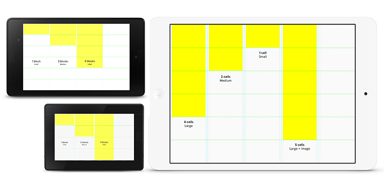
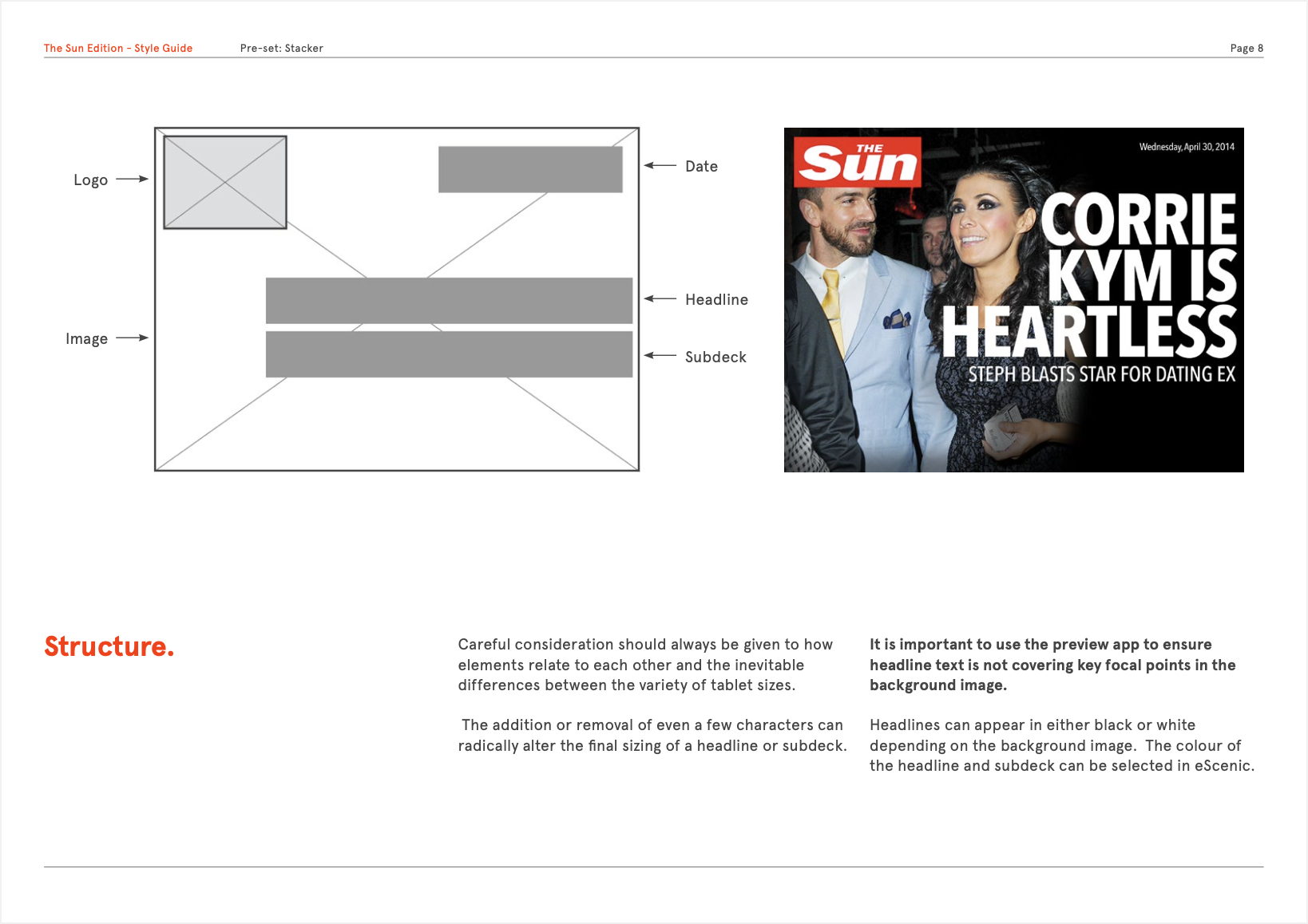
Working with detailed research material supplied by the client, wireframe modelling and prototyping allowed for successful user testing of a interaction model based around a horizontally scrolling, immersive tabloid styled concept. This created the potential for ‘dip in, dip out’ easy reading aimed at the core readership of the parent publication.Using a flexible and solid, yet scalable, grid structure, I was able to devise a solution that was reactive to both the size of the device in use and the type of content being displayed.

The build concept split the key screen sizes into cells capable of holding a given length of copy.
These cells were based on the size of articles used by The Sun editors for both online and in the physical paper.
Implimentation
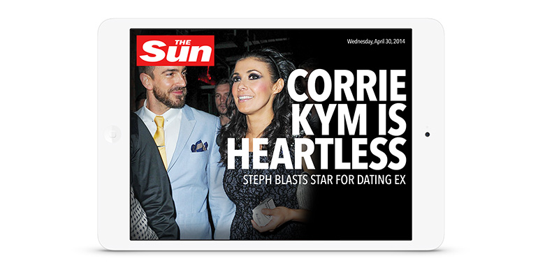
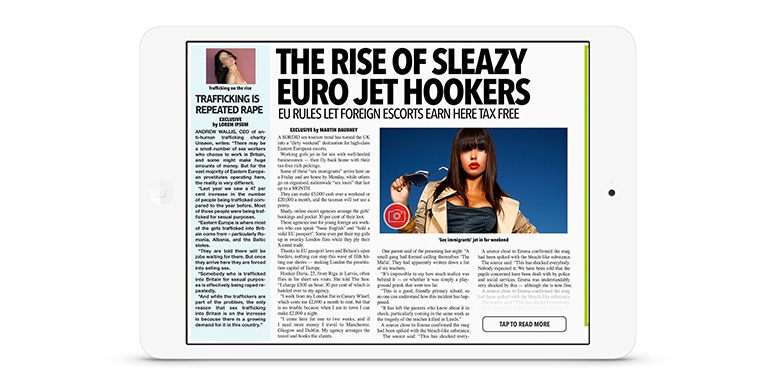
Working closely with iOS and Android developers, a page building framework was devised that allowed for a consistent build across varying device sizes and operating systems.As the cells and grid were combined, a range of flexible templates were created allowing editors to quickly and easily create bespoke layouts that were constent across the varying devices.


Delivery
I created detailed reference documentation that outlined template structuring, type use, word counts etc to assist The Sun editors workflow.


| Role: | Design Lead |
| Project: | Visual Design, Design Patterns, UX Design |
| Client: | The App Business |
| Creative Director: Iain McConchie | |
| Project Manager: Antonia Redgrove | |