Ideas.
Problem solving.
UI/UX design.
Art direction.
Tea drinking.
Contact
UBS Neo
A ground-breaking initiative to create an entirely new approach to the investment banking client engagement, UBS Neo is a platform that unifies and delivers the very best of UBS – its people, content, research, trading ideas, pricing and execution capabilities. Providing the firm’s clients with a seamless cross-asset experience, and a fully integrated cross-functional experience, all in one place.Responsibilities
– Ideation– Art direction
– UI design
– Interaction design
– Typography
– Design system
– Documentation
Spanning the initial research, concept and prototyping through to the detailed analysis, design strategy, mobile strategy, solution wire-framing, visual design, taxonomy and search engine design, I defined the typgraphic structure use across the platform, and working alongside a UX designer, the grid and large data set systems.
As the project progressed I contributed data visualisation tools, set, policed and maintained the visual pattern style guide and SDK. I also defined the second generation design of the platform.
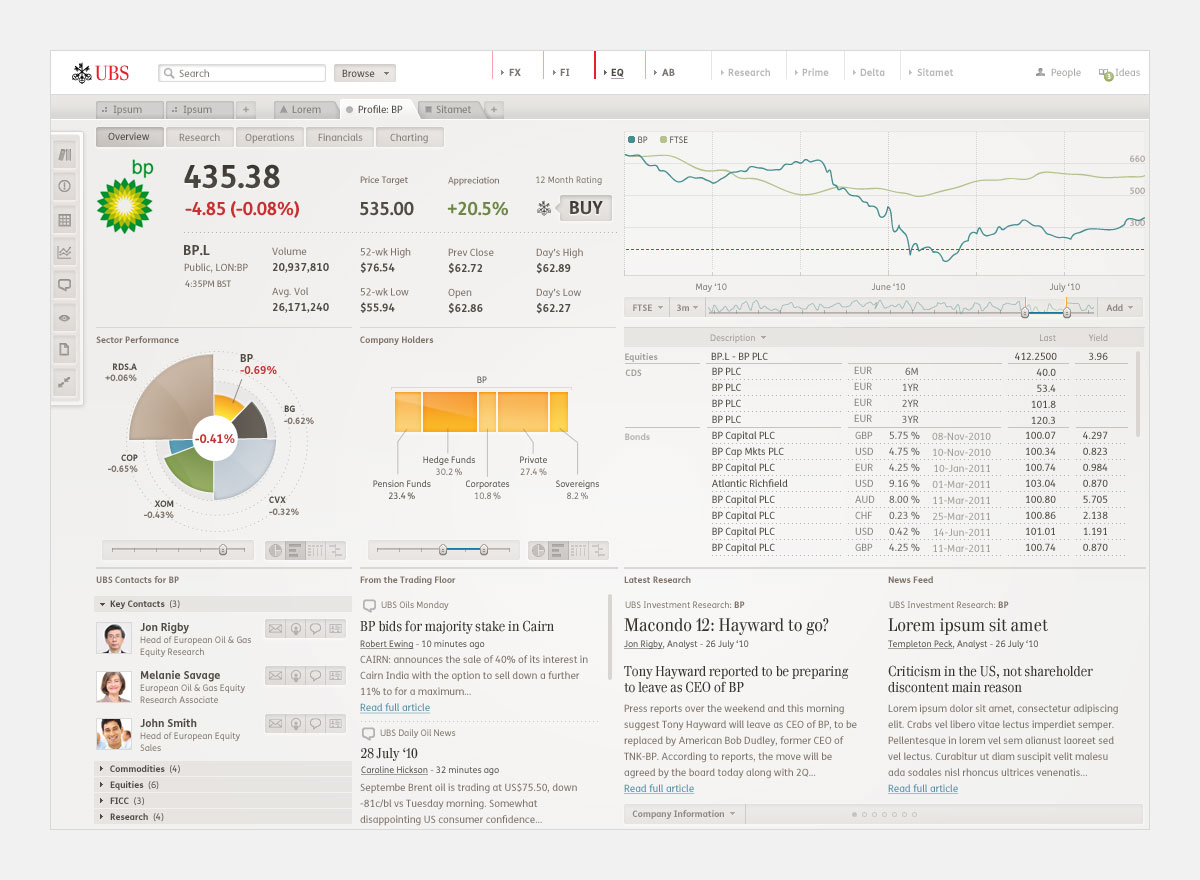
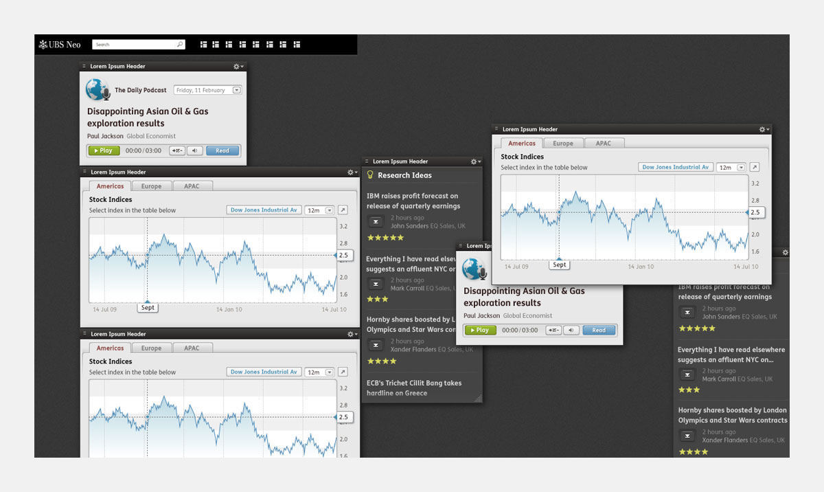
Platform design
The platform quickly expanded, it out grew it’s initial design patterns, becoming evident that there was a need to reshape it’s visual language.I provided a flexible and scalable visual style improving the legibility of the platform, allowing for an increased amount of content.

Visual and interaction design
The application went through many stages of visual development, changing and refining as the project grew and evolved. The designs below show a snapshot of this process.
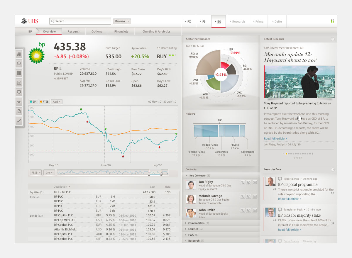
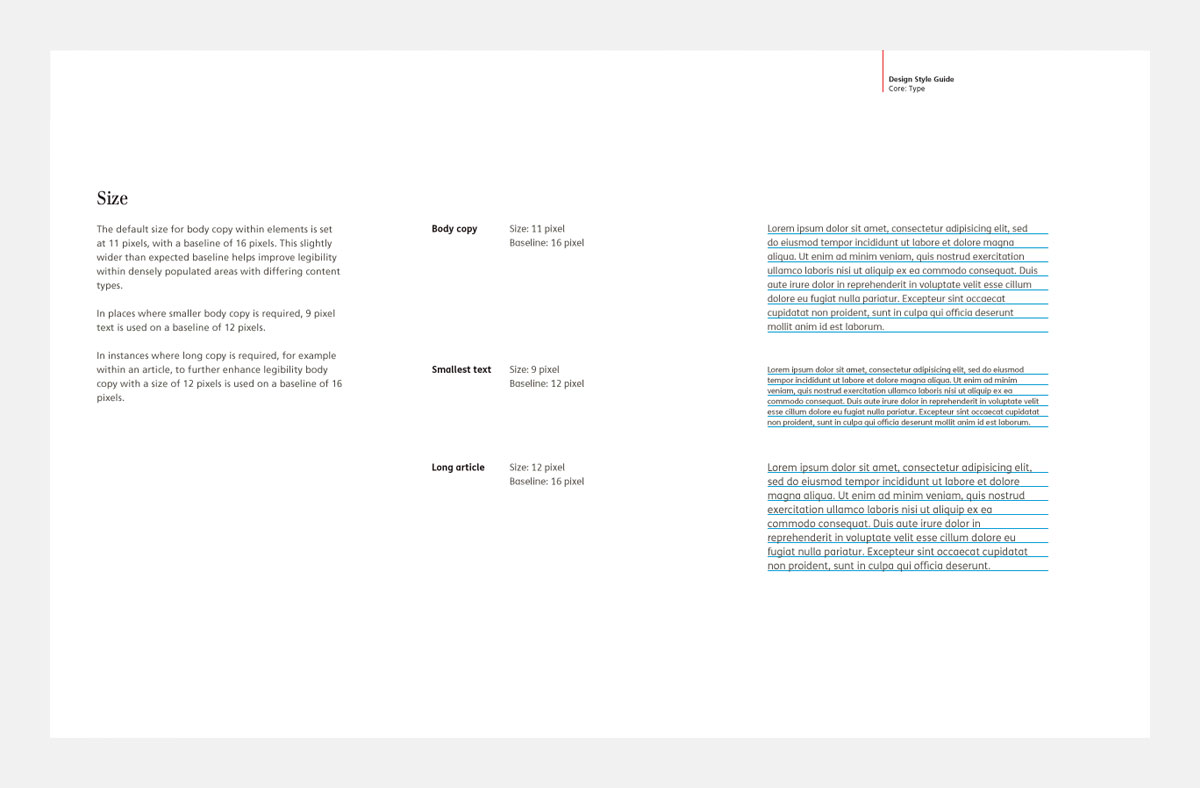
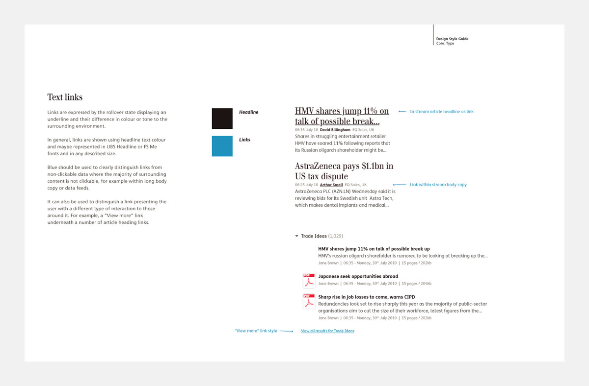
Typographic development
I provided the groundwork for the use of type on the platform.As legibility was of upmost importance within such a potentially crowed space, everything from the choice of font to the baseline grid would prove to be a core foundation the application was built on.
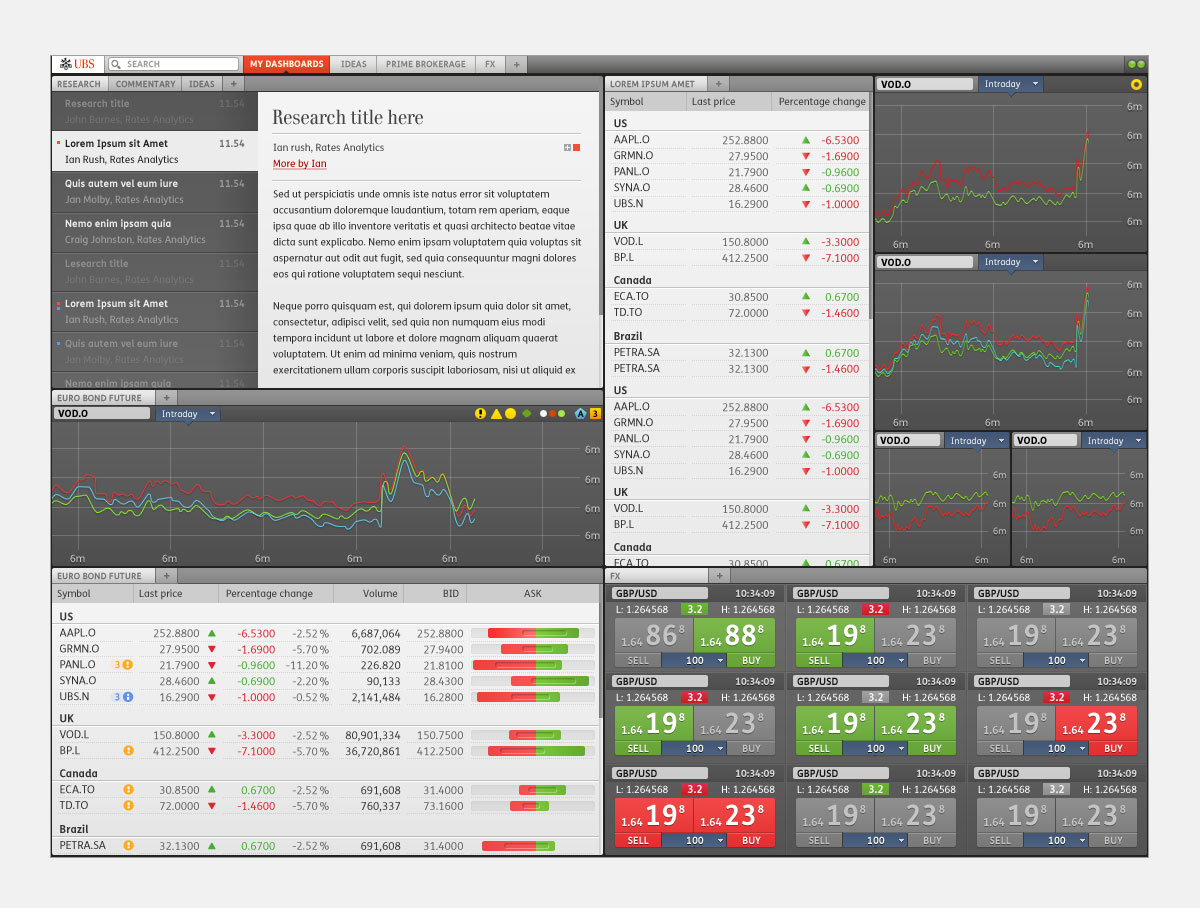
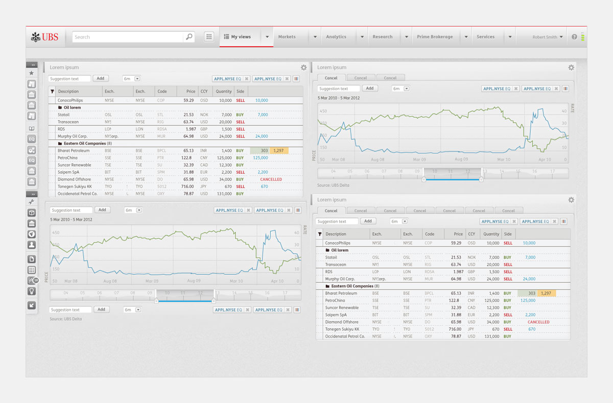
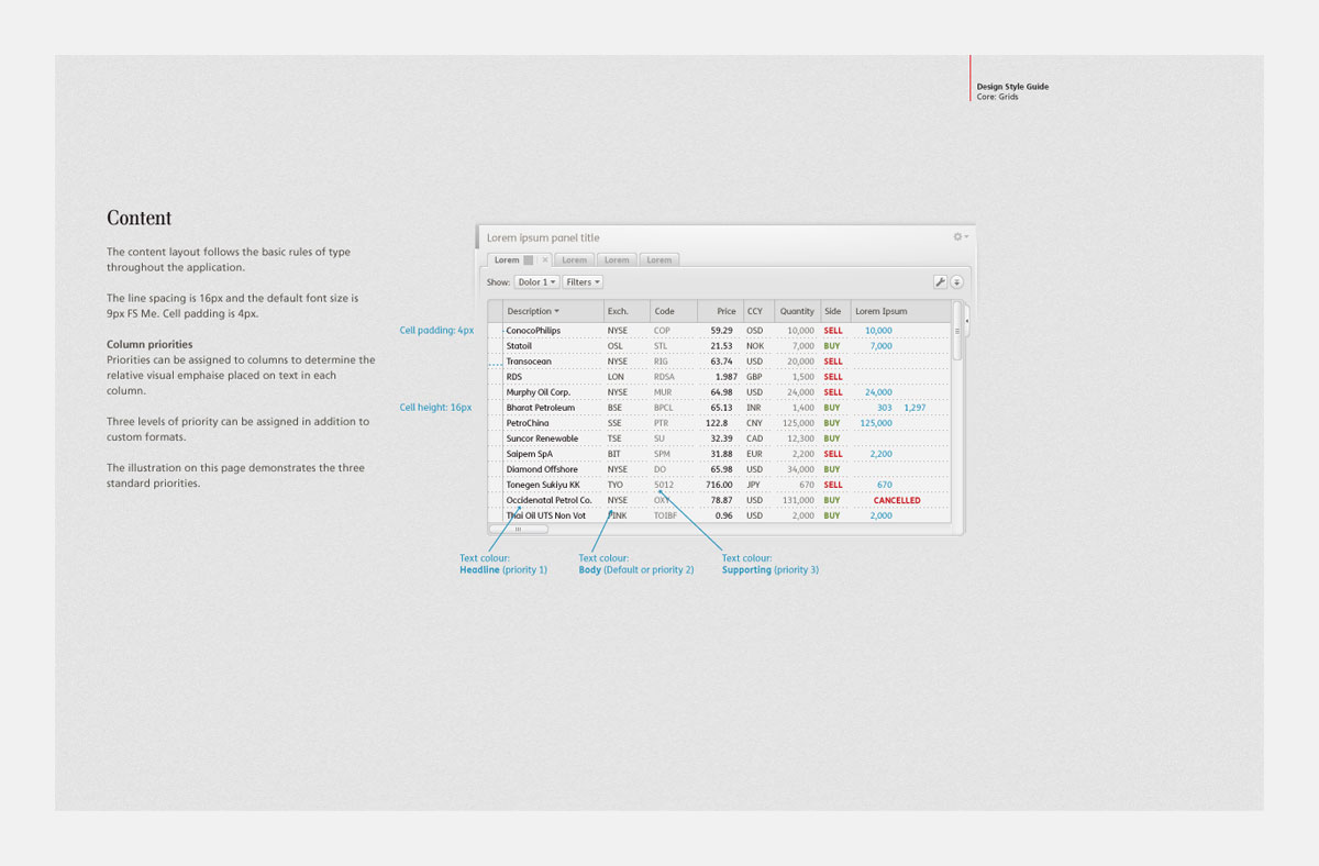
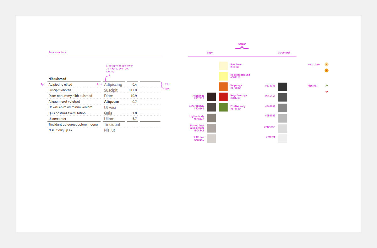
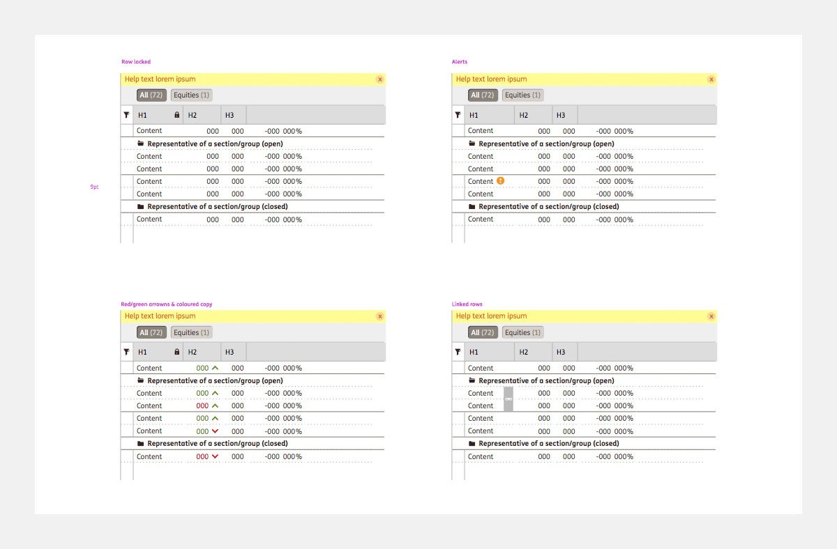
Grids and large data sets
Data visualisation is the peg from which trading applications hang their hats and grids displaying large amounts of numerical data are the cornerstone of each aspect of the project.Working closely with a UX designer and stakeholders, the core of the project was to display as much information in a condensed space in as legible manner as possible. This was achieved by defining simple visual rules - from line types and text alignment to defining areas of visual importance.

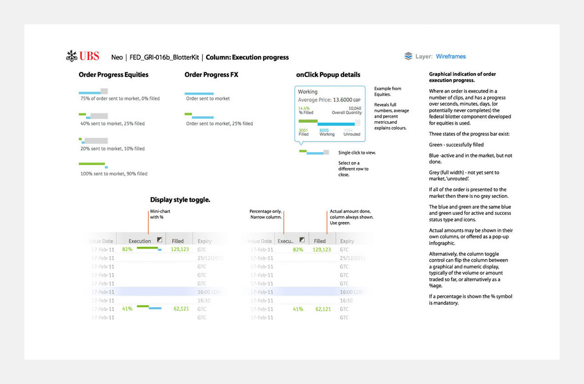
Data visualisation tools
I devised several data visualisation tools that focused on ease of communication of complex ideas.The example below shows an execution process graphic that would be found within a grid on a blotter, capable of fitting many copies within a tiny space yet displaying all the necessary information.
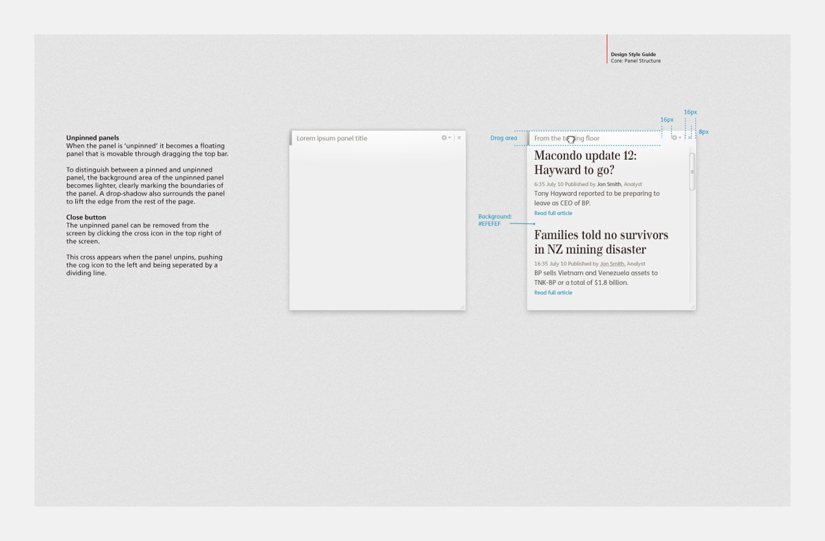
Design system
I was responsible for the creation and maintance of the platform’s Design system, ensuring the consistent use of design throughout all components on the platform.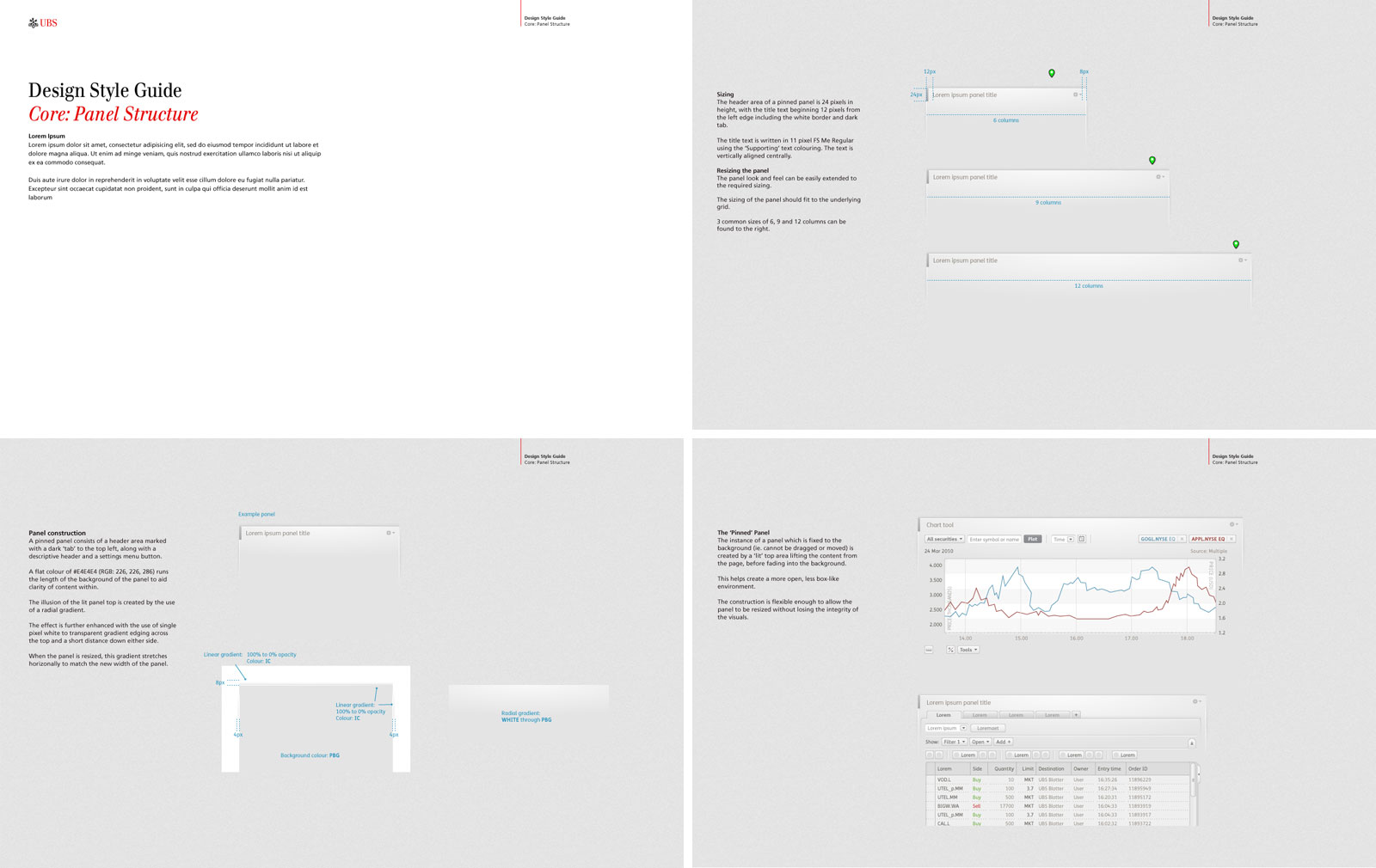
| Role: | Design Lead |
| Project: | Typography Data design Visual design UI/UX design |
| Client: | RMA Consulting |
| Head of Design: JP Stapleton | |
| Design Lead: Andrew Mackay | |
| UX Lead: Sarah Parker | |