Ideas.
Problem solving.
UI/UX design.
Art direction.
Tea drinking.
Contact
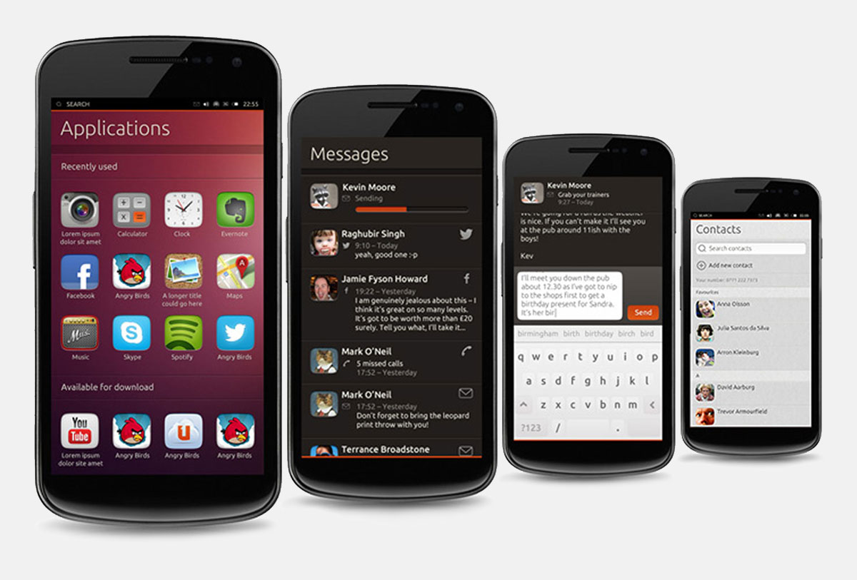
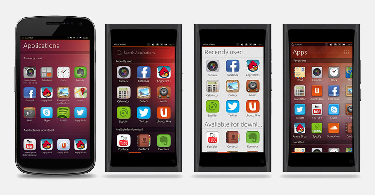
Ubuntu Touch
Uniquely distinctive, yet undeniably part of the convergent Ubuntu family, the Ubuntu Touch operating system was described as "looking more elegant than Android, and more functional than Windows Phone" by VentureBeat and was awarded Best of MWC by CNET at the Mobile World Congress.Responsibilities
– Art Direction– Ideation
– Visual design
– Interaction design
– Design specifications
I provided the brand elements, the initial look and feel and visual design patterns of the mobile operating system Ubuntu Touch.
Continuing my work from the Ubuntu Typography project along with aspects of the Ubuntu One music mobile app, while adding flexible, distinct elements to create a unique, undeniably Ubuntu experience.
The design of the Ubuntu phone builds on the strong typographic history of Ubuntu, with strong use of type and a distinct Ubuntu Shape derived from the Ubuntu font.
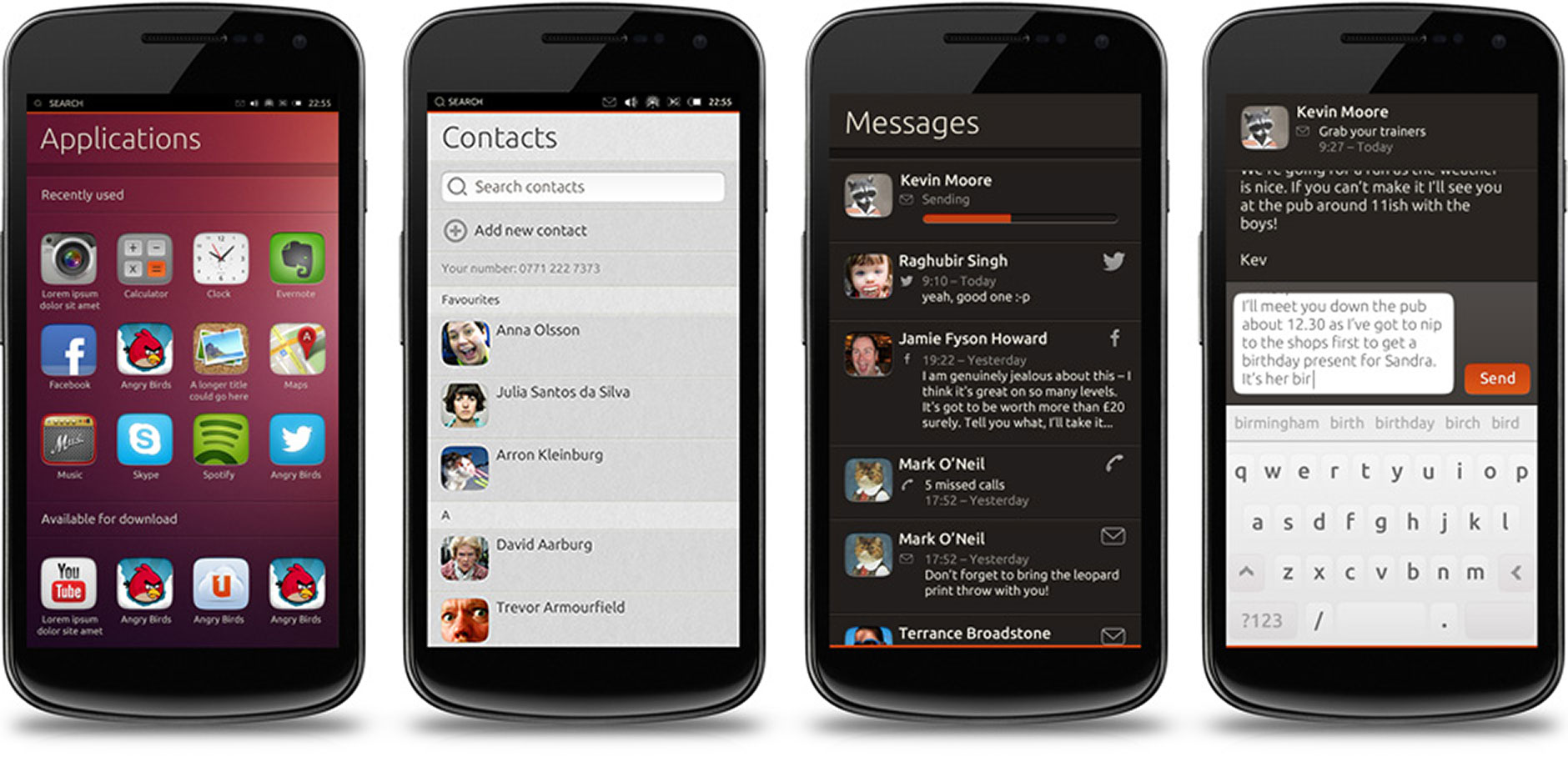
Visual and interaction design
The styling of the mobile interface is deeply routed in that of the Ubuntu family, but is distinctive as a separate entity. Details of these can been throughout the Ubuntu App Design Guidelines.
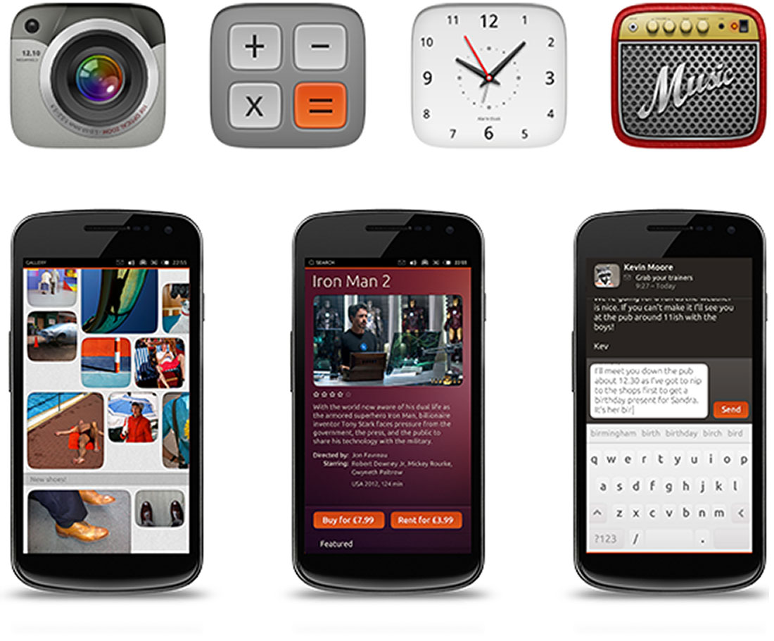
The Ubuntu shape
A flexible rounded edged shape that can be stretched and moulded to meet differing needs at a variety of sizes was developed was a unique brand element.
Inspired by elements within the Ubuntu font, the shape sits comfortably with the bold use of text and is undeniably Ubuntu.

As the look and feel develops, the influence of the Ubuntu shape can be see to spread further through the Ubuntu family.
The flexibility of the Ubuntu shape is a key factor in maintaining the distinct look.
The ‘Orange flash’
Originating from design and brand work for Ubuntu One website and mobile music app, a strip of orange, a key colour in the Ubuntu palette, is used to denote the presence of Ubuntu without being overwhelming.‘Cut in’ dividers
An important element of the design when used in conjunction with type of the cut in dividers create structure within pages. Used in a small number of sizes, the dividers also help create meaning.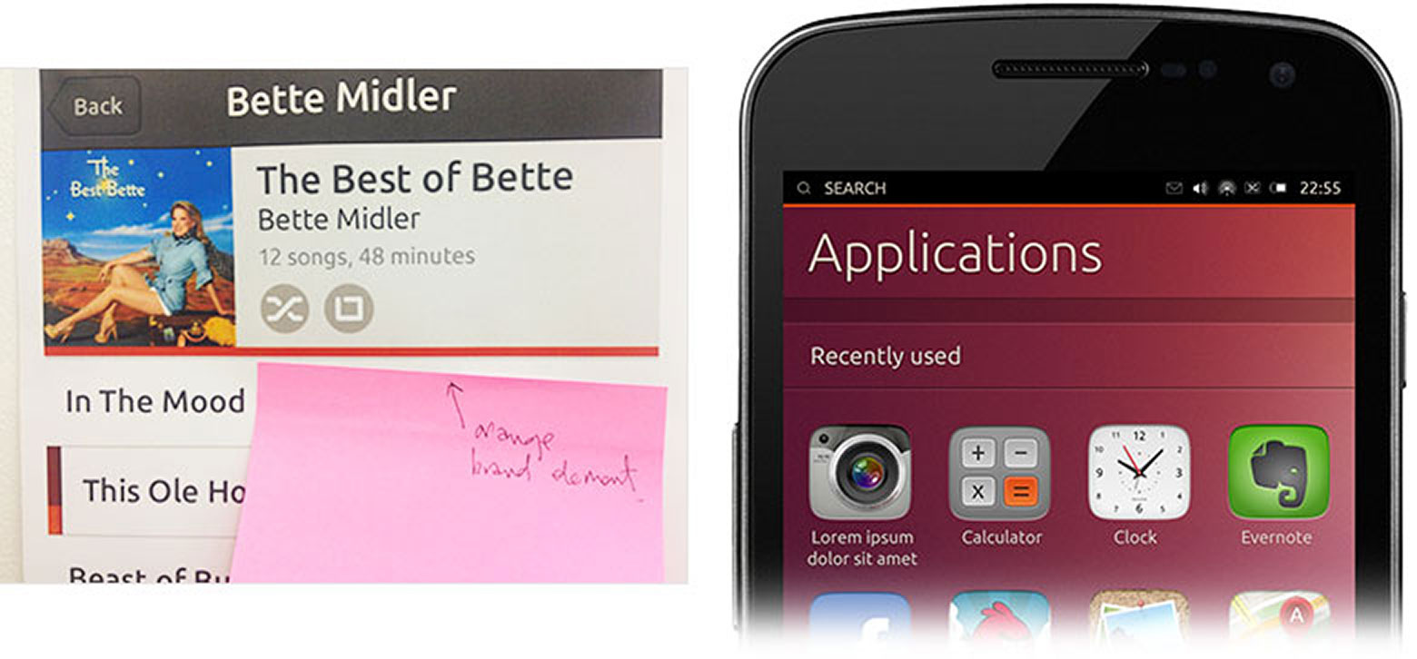
Use of type
Typography plays a key role in all Ubuntu products, making the operating system clear, legible and therefore easier to use while also re-enforcing the Ubuntu brand. I provided the typographic framework, building on my earlier Ubuntu Typography project.
| Role: | Art Direction |
| Project: | Look & Feel, Visual Design Patterns, Consistency Policing |
| Client: | Canonical |
| Head of Brand & Visual Design: Marcus Haslam | |
| Head of Design: Evo Weevers | |
| Creative Strategy Lead: Ivanka Majic | |
| Lead UX: Oren Horev | |
| Lead UX: Mika Meskanen | |
| Interaction Designer: Calum Pringle | |
| Illustrator: Matthieu James | |